Manchester United Logo ReDesign

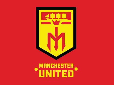
With Juves rebranding i thought i would take a crack at a classic English Premier teams logo. My purpose was to simplify and modernize, but keep the logo familiar for fans, and stay with the clubs traditions. The crest stays the same shape as crests in the past, the type and ribbons are left out to create more of a focus on the club as a whole. A thick black border is added around the crest to add focus when on the jersey and a nod to the badge of the 1960s.The ship at the top of the logo is slightly altered but kept there for tradition and brand recognition. I used the red devils pitchfork and negative space to create a MU, to be used as a stand alone logo off the pitch and as a nod to the Red Devil nickname.


